It is needless to say that a great, easy-to-use UI (user interface) is necessary for optimal customer experience. According to studies, 75% of baby boomers like simple UI, while millennials also favor minimalistic design.
However, despite the importance of simple and clean UI designs, many unethical designers use negative tactics like dark patterns. The primary objective of these is to trick consumers and manipulate shoppers’ decision-making process. The use of dark patterns in user interface design is common in the eCommerce industry.
In this article, we will discuss:
- What are dark patterns in UI design?
- What are the common dark patterns used by developers?
What are dark UI patterns?
Dark UI patterns are deceptive practices that web or app developers use to influence the behavior or purchasing patterns of consumers/customers. These dark practices mainly force users to take unwanted actions that they may not have taken under normal or fair circumstances. For example, they may make a user share personal information, make an unnecessary purchase, or sign up for an unwanted service.
The idea behind these patterns is simple-they target users’ insecurities, weaknesses, or their lack of knowledge. Let’s have a look at some commonly used dark patterns in UI designs.
8 Most Common Dark Patterns in UI Design
There are multiple ways developers use dark patterns, and the worst thing is that they are frequent nowadays. According to a study of 240 apps, approximately 95% had at least one dark pattern in them, while there were over 1700 different dark patterns. Here are some of the most common ones.
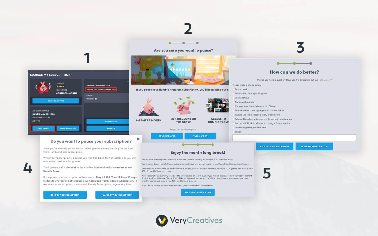
1. The roach motel
Businesses use the roach motel pattern to trick users and urge them to sign up for something such as a newsletter or an event. Generally, they provide insufficient yet triggering information to prompt users to take action.
For example, imagine you are checking out from an online store and see a checkbox that says, “Subscribe for 5% off now”.
Now, this is incomplete information, but it may be intriguing to you. The only thing you may see around that checkbox is “I decline,” which sometimes doesn’t work either. Companies use this tactic to get personal data (email, phone numbers, etc.) of the users.
2. Confirmshaming
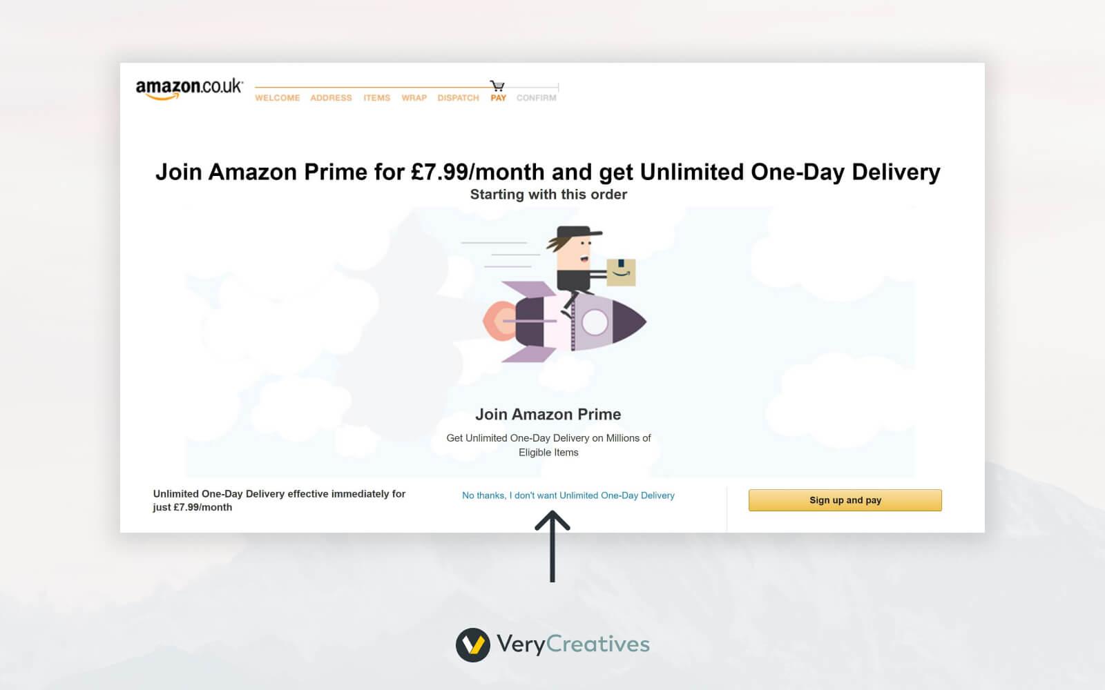
Businesses can make you feel ashamed or embarrassed for not taking the action they desire. The objective of confirmshaming is to make users feel bad or that they may miss out on something very important.
For instance, you may see phrases like “No thanks, I’m not interested in delicious recipes.” These words will make you feel you are missing out on something, and saying no might sound rude here.
3. The bait and switch
It is one of the most deceptive patterns in UI design in which sellers use exciting images and attractive (but fake) offers for cheap products or services. Once the hook works, the seller replaces the cheap product with a more expensive one. Of course, it is a highly deceptive method that diverts buyers.
Sometimes, the low-priced item offered may be of poor quality, which may encourage buyers to choose a higher-priced item that offers better value. In a nutshell, sellers show two similar products and urge the buyer to opt for the expensive one to make more profits.
4. The disclaimer
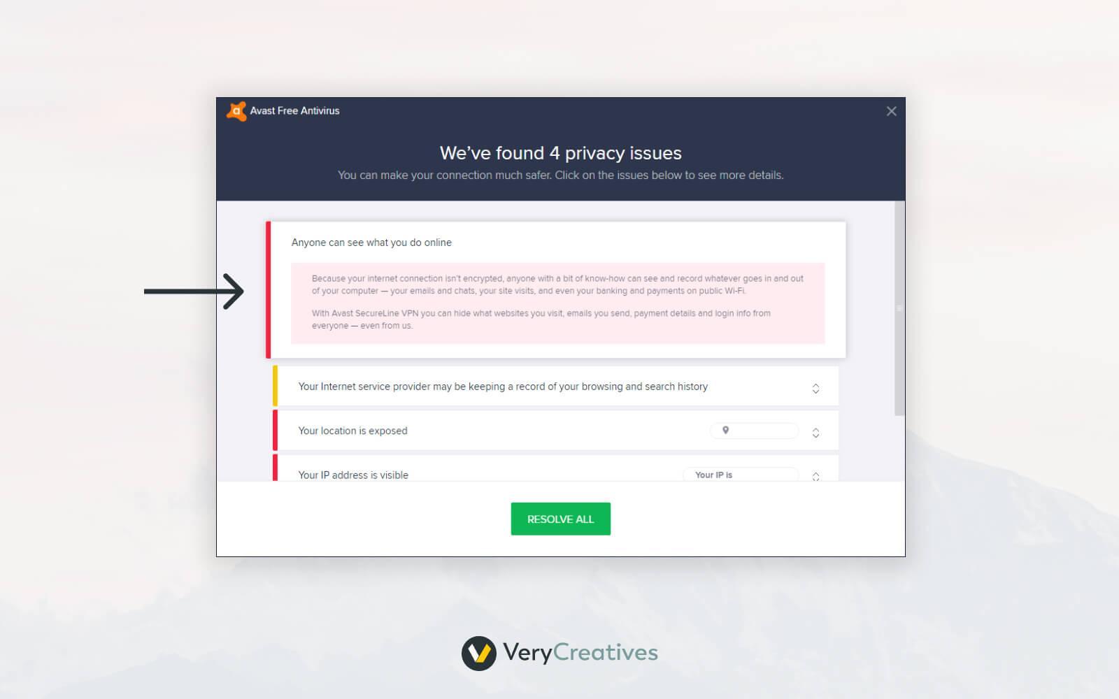
Disclaimers are amongst the most commonly used dark patterns in UI designs. They trick users into agreeing to terms or services they don’t actually want. Sellers do this by making it seem like these terms are just part of getting new features or signing up for something. Such tactics are used when sellers want users to sign up for a new account.
For example, you might agree to let them contact you just to move forward with creating an account. Then, once you have already signed up with your personal data, they show you more terms and conditions. At this stage, you might want to go back, but you have already shared your personal data.
5. Forced continuity
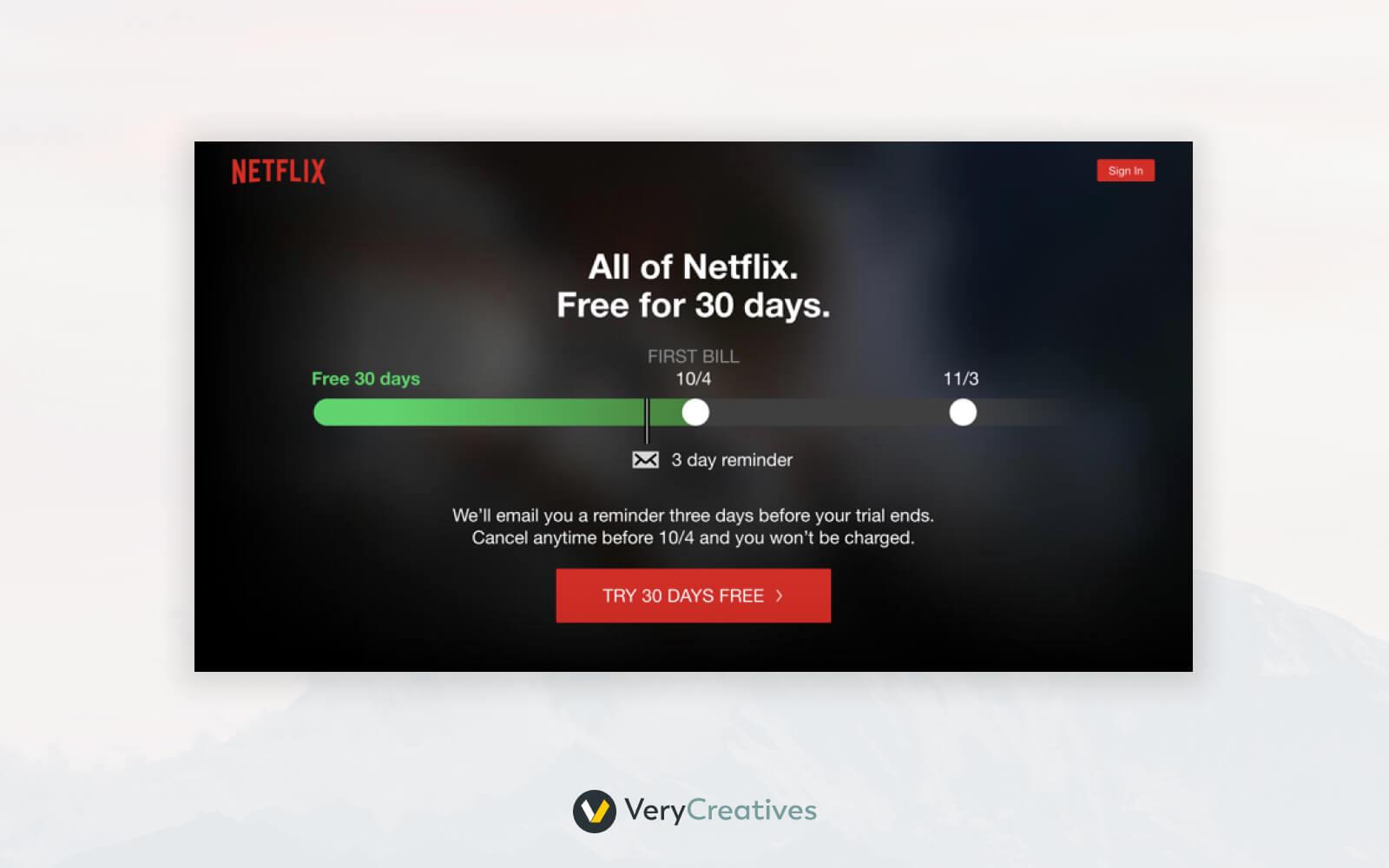
Forced continuity is simply like robbing users without even letting them know about it. This tactic includes inviting a customer to use the free version of a product or service and then silently start charging them after the expiry of the free trial.
Most importantly, sellers mostly don’t give any warning/notification of free trial expiry. Also, buyers usually don’t get the option to cancel their subscription automatically.
6. Disguised ads
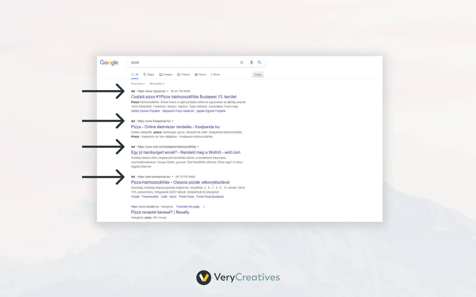
Disguised ads are highly deceptive, and users often fail to spot them. According to standard practices, there must be a clear indication of ads running on a website or similar platforms.
However, businesses often display ads without telling users about them. These disguised ads are usually placed in blogs, picture galleries, etc. As users don’t read everything carefully, which makes it difficult to spot these ads. 34% of users often click ads by mistake, and 15% of those said that they were tricked into it.
7. Trick questions
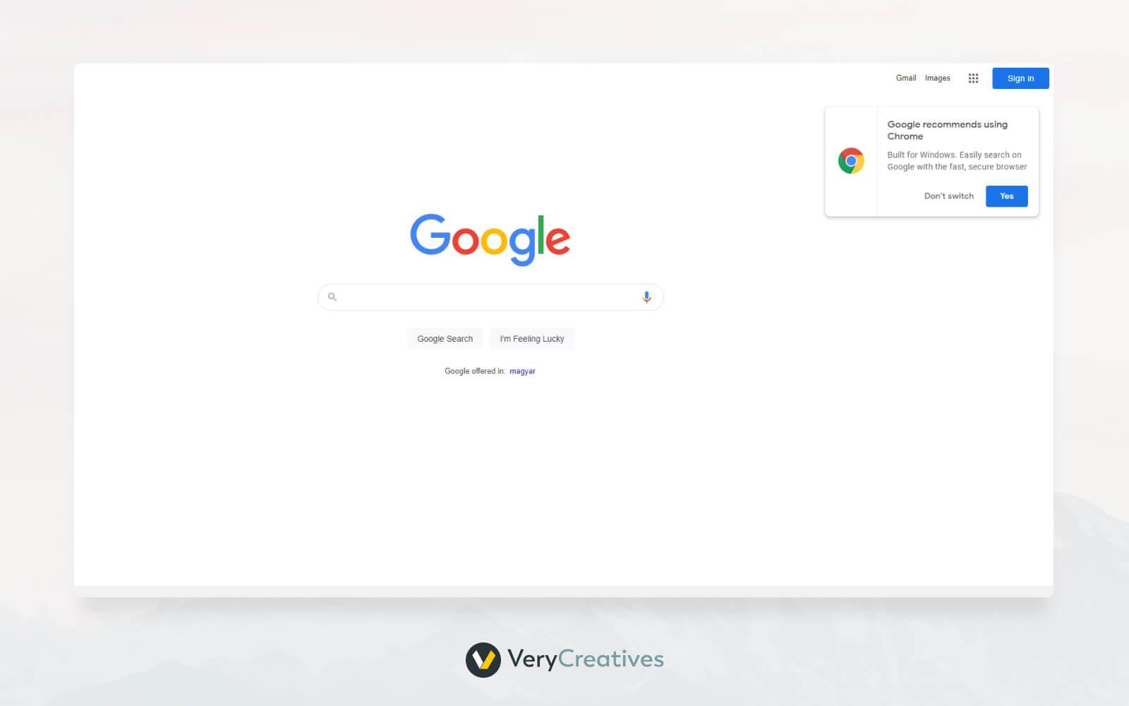
Trick questions allow sellers to make people buy something by making it interesting, catchy, or sometimes confusing. These questions are tricky because their real meaning isn’t obvious, and users have to look closely to understand them.
People often browse casually, so they might click the wrong answer without realizing it. You may see a question that says, “Are you sure you don’t want to cancel the service?” If you click “Okay,” you agree that you don’t want to end the subscription.
8. Hidden costs
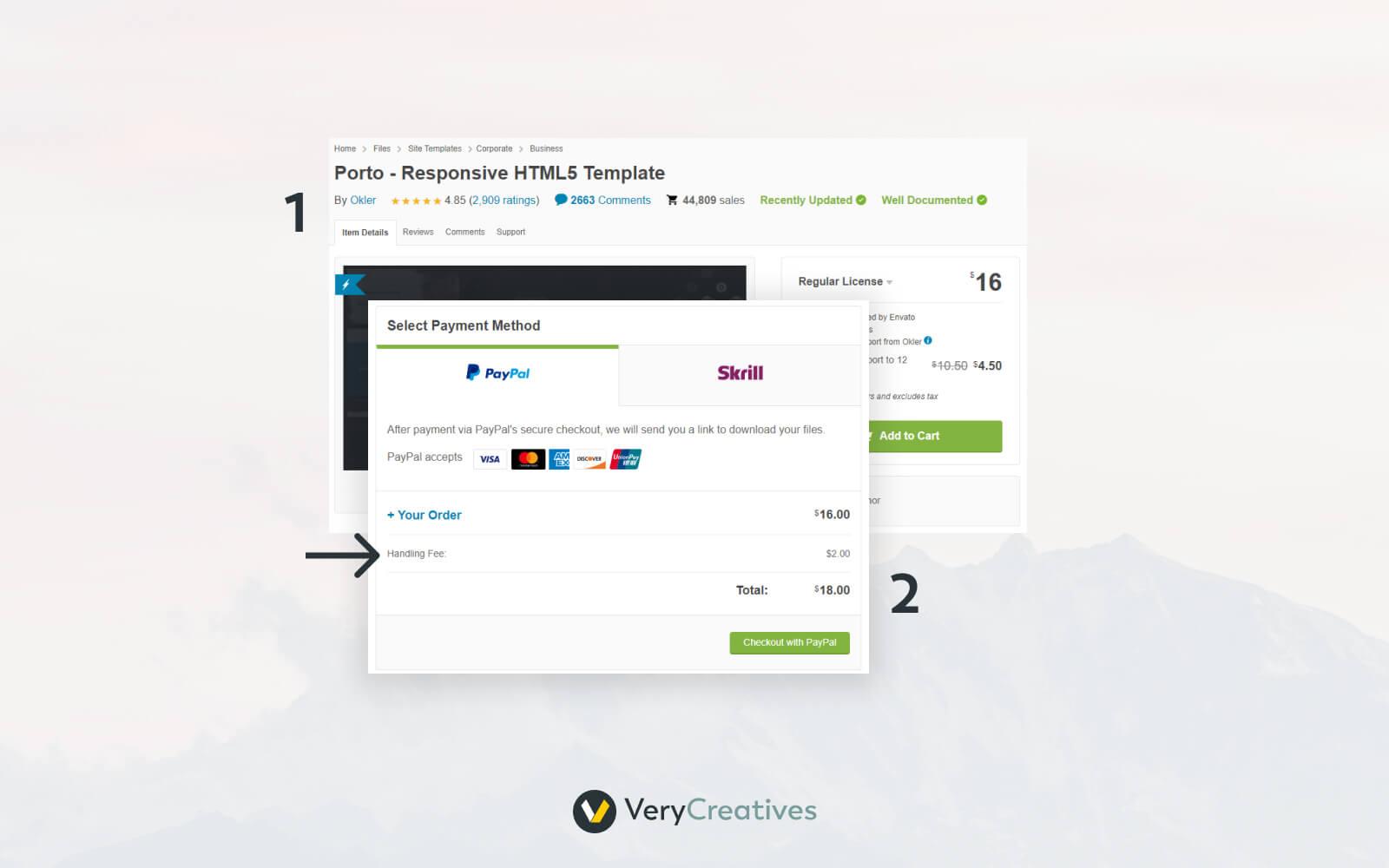
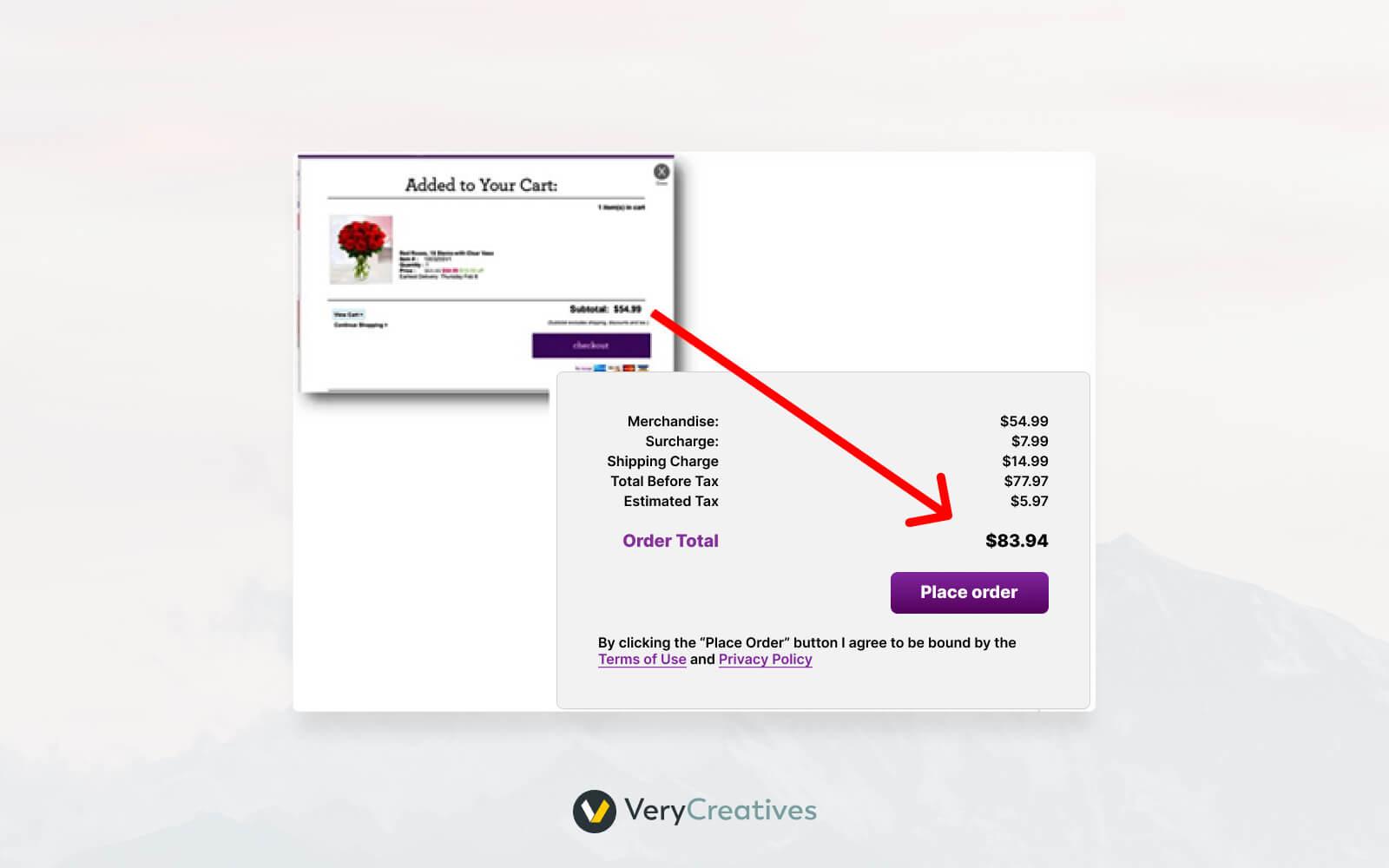
Another highly common dark pattern in UI designs shocks the customers with additional taxes, shipping costs, and similar charges at the last stage of the purchase process.
Brands using such practices show unbelievably low prices of products or services. However, just when the customer is about to close the purchase, the company shows hidden costs like shipping charges, taxes, etc.
Frequently Asked Questions
Why are dark patterns illegal?
Dark patterns in UI designs are deceptive and manipulative and force users to make negatively influenced purchase decisions. That is why dark patterns are a violation of Federal Trade Commission (FTC) standards.
What is the psychology behind dark patterns?
Dark patterns are similar to nudges because they both use similar ways to influence people. Dark patterns use tricks based on how people think and make decisions and may force them to buy or subscribe to things they don’t even want. Such practices also collect personal user data unethically.
What is the danger of dark patterns?
It isn’t hard to understand that dark patterns affect not only customers’ trust but also businesses using them can face hefty legal penalties.
Summing it up
Dark patterns in UI may help companies in the short run, but they will eventually lose customers and, thus, business. What’s more, it is a violation of laws across different parts of the world, and such sellers may face severe legal consequences.
VeryCreatives provides expert tips to make your UI designs more attractive, converting, and customer-centric. Try our on demand design subscription for 7 days – and get a full refund if you don’t like working with us. No questions asked.