Building a brand new SaaS company from the ground up can be a daunting undertaking. You’ve probably already thought about some of the important considerations you’ll need to make as your product progresses. One essential concept that can make or break your new software is UI (user interface) design.
Without high-quality, user-centric design, your software may be deemed out of date or even unusable by many potential clients. In fact, according to GoodFirms, 73.1% of web designers think that non-responsive design is one of the main reasons why visitors leave a website.
So, if you’re hoping to build a product that people love, understanding the principles of UI design is crucial. Read on to discover some vital concepts that will help you design a product that clients can’t wait to use.
What are UI design principles?
In theory, UI design principles are the rules that designers should stick to while creating software. But, of course, the first rule in design is that rules are meant to be broken. Sometimes, however, it’s good to have a set of guidelines you can reach for when beginning work on a new project.
The best way to design software that humans intuitively understand? Use design principles derived from our human nature-psychological and cognitive traits that, when understood, can help you to improve and take your designs to the next level.
8 key psychological UI design principles
1. Gestalt principles
Derived from the German word Gestalt (meaning “form”), Gestalt psychology is a theory of perception. It’s mainly concerned with how our minds make sense of the world. Its main suggestion is that people do not perceive objects as individuals in themselves; rather, as smaller elements of a larger system.
Let’s take a look at how this principle can be applied to SaaS UI design in practice.
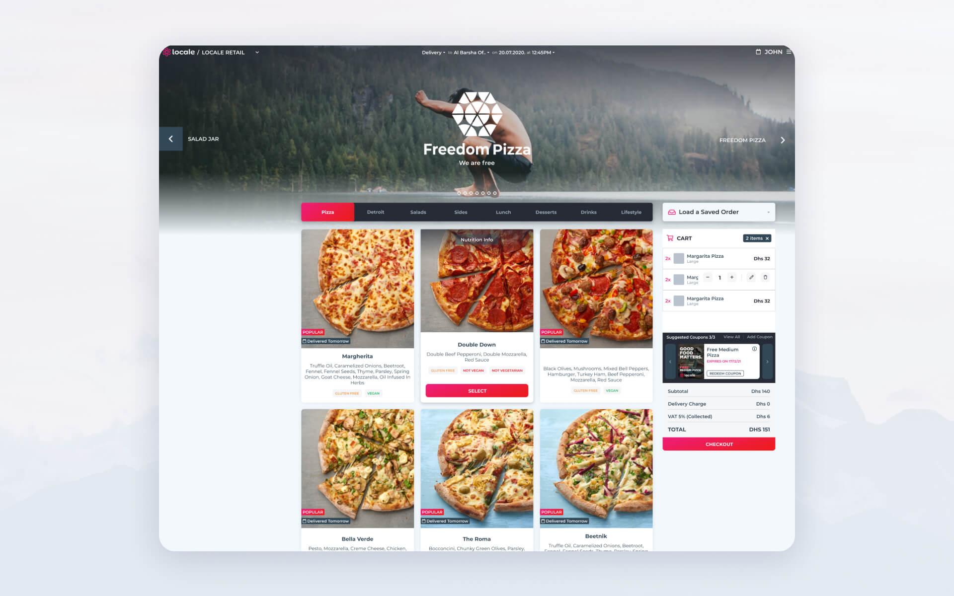
In this design, everything works together seamlessly. When we look at it, the brain doesn’t perceive individual, unrelated items. Because of how the individual items are placed and organized, we perceive a cohesive, intuitive whole.
- The Categories menu, the menu cards, and the cart lists have similar items grouped into closed sections.
- Margins and paddings are binding items together.
- Menu items are a continuous list you can scroll through.
- The Next and Previous brand buttons are on the left and right, creating symmetry.
2. Hick’s Law
This principle comes from British and American psychologists William Edmund Hick and Ray Hyman, who theorized that increasing the number and/or complexity of choices results in an increase in the time required to make that choice. In UI design, this theory translates into the idea that increasing the number of choices is limiting and time-consuming for users.
Here are a few examples of how Hick’s Law can be used:
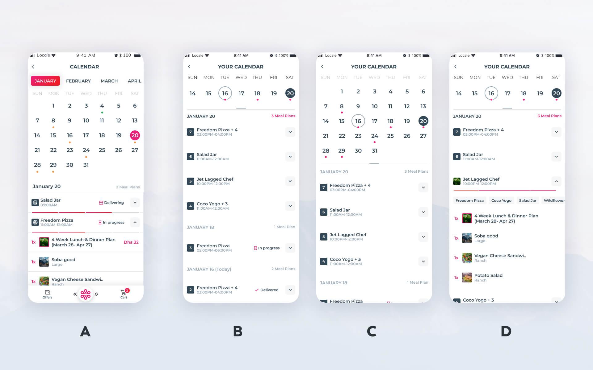
In the first version, the layout is too complex with too many options, which can leave the user confused and frustrated.
In the second version, things are less complex because items are broken up into separate screens. In image B, you see the user’s opening screen. On this screen, you only see what is most important at a first glance-only the base list of orders and the current week are visible. In image C, you see how users can open the calendar to view past or future orders. In image D, you see how users can open each individual order to get details and more info as needed.
So, instead of piling all information onto one screen, good designers should aim to keep things simple by using multiple screens to limit the number of options on one screen.
3. Miller’s Law
The average person’s short-term memory capacity is limited. In theory, we can keep five to nine things in the mind at one time.
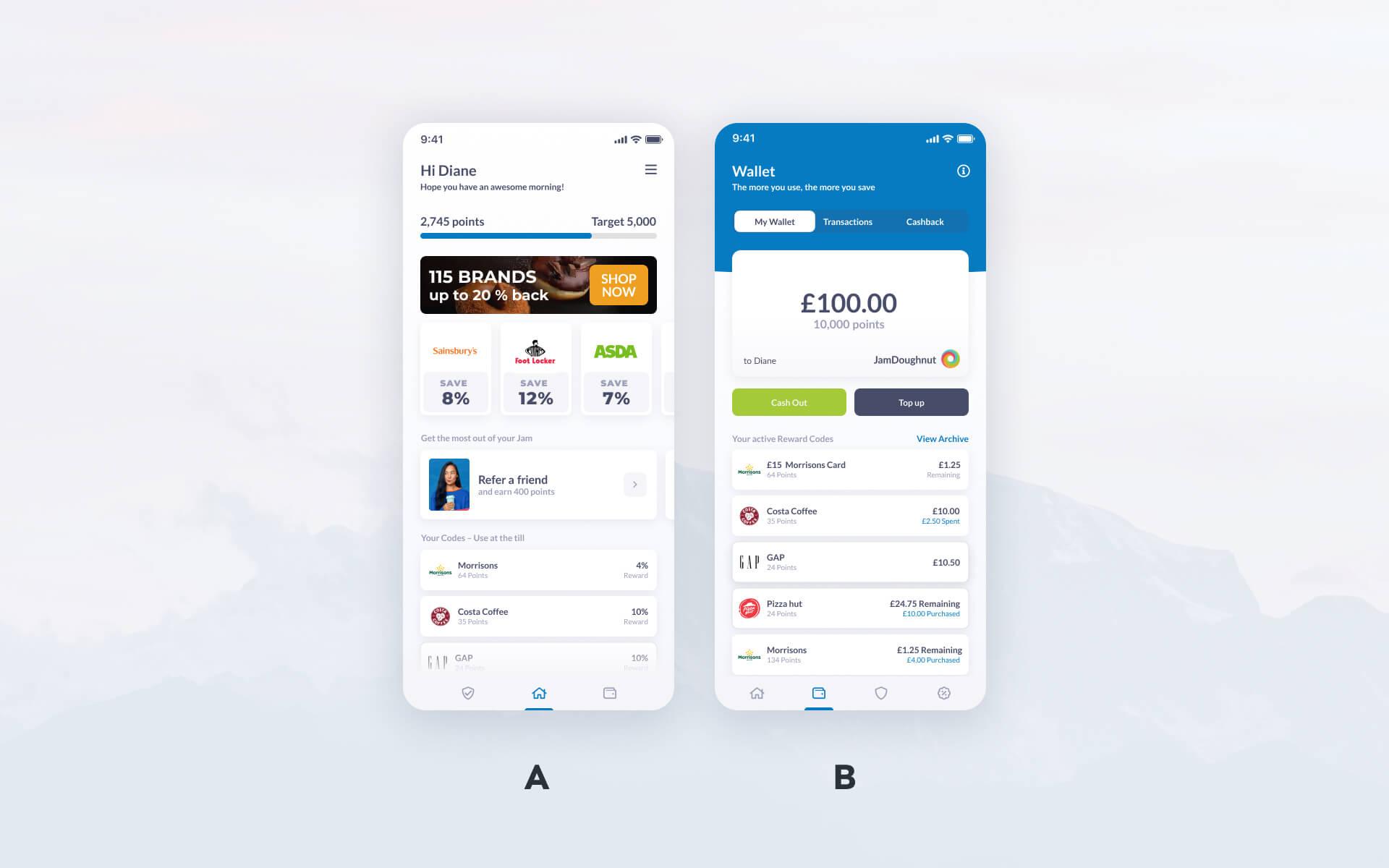
Based on this principle, app screens should have three to four distinct groups and corresponding actions. In the above example, we have:
1st screen:
- Welcome
- Your points and available brands
- Useful information
- Coupons you already have
2nd screen:
- Where we are
- Submenu for content under this section
- Main card with your balance
- Codes you already have
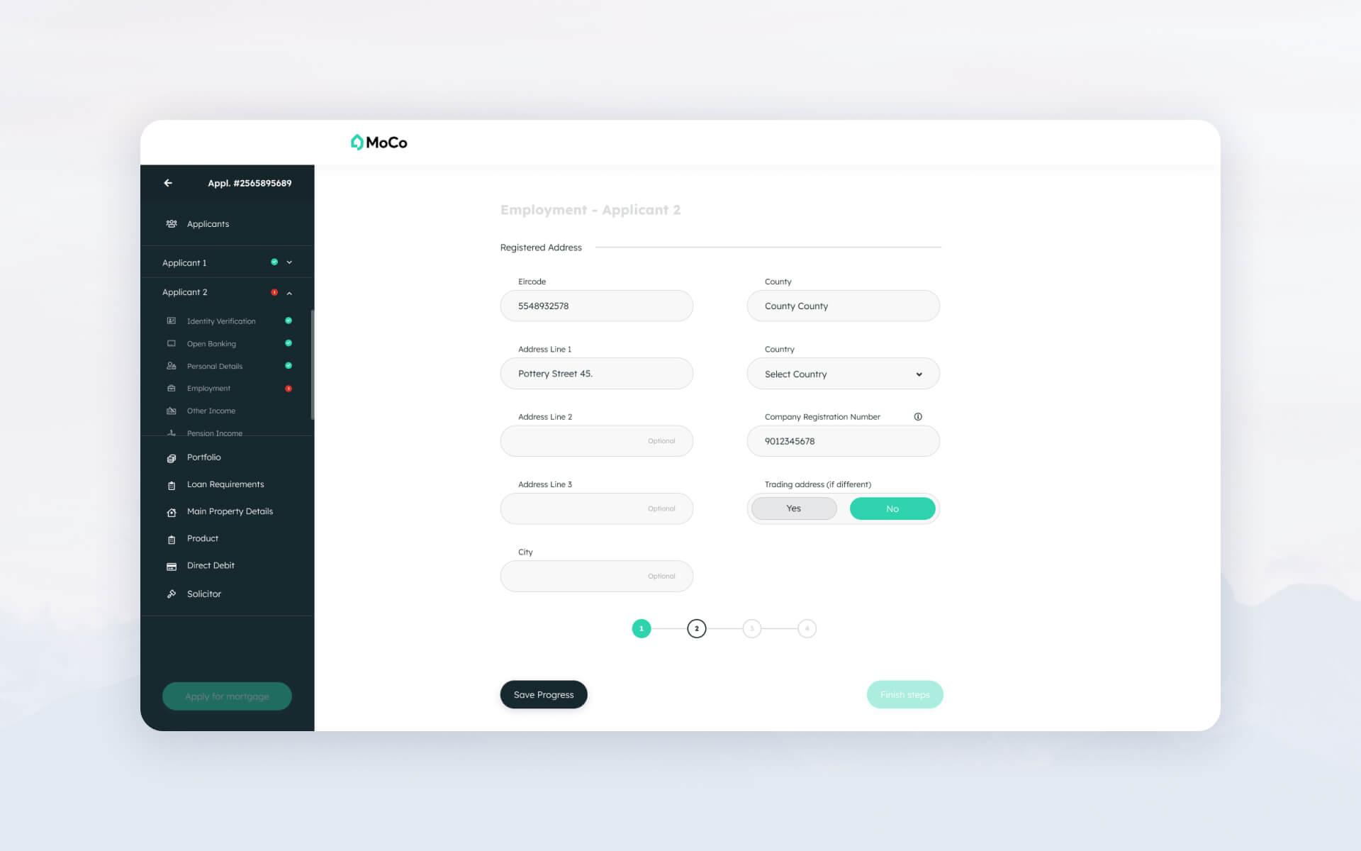
In this example, we have Moco, a complex loan appliance service where the user has to fill out a lengthy form with multiple choices and a lot of data. To ease the long process, the main idea was to create a table-of-contents-like sidebar on the left side of the screen and divide up the application process into smaller sections with fewer items, making it easier to follow. Simultaneously, we also wanted to keep indicating clearly where the user was in the grand scheme of the application.
4. Jakob’s Law
This is the concept that familiar patterns help the brain. In design, this means that following common design best practices is usually the right choice-people prefer to use things that they are already familiar with.
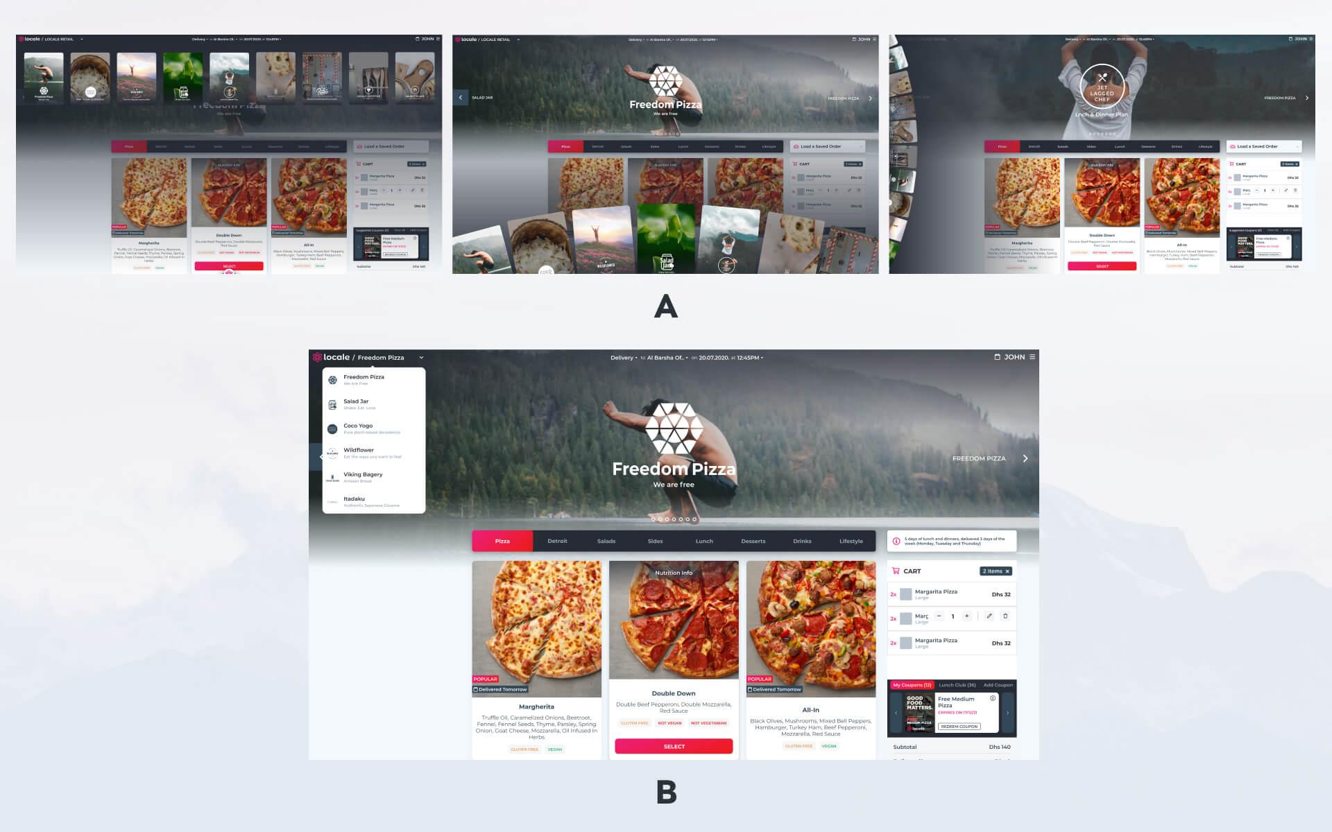
As you can see above, unusual ideas for navigation, while they might look nice, are potentially confusing to the user. Sometimes, it is best to stick with a more conservative but easier to understand solution like the dropdown menu.
After all, based on a survey by Clutch, 94% of people find that easy navigation is the most important design element.
5. Occam’s Razor
Occam’s razor is an ancient theory that states that the simplest answer is usually best. Designers often have a tendency to over-complicate, but usually, sticking with the simple option is the right way to go.
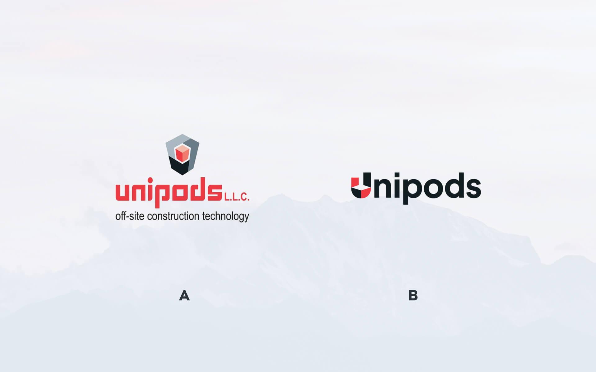
In this example, you can see that the first logo features an image, a name, and a subheading. The second option is far more simple and, therefore, more memorable.
6. Serial position effect
According to the serial position effect, the first and last elements of a list are the most likely to be remembered.
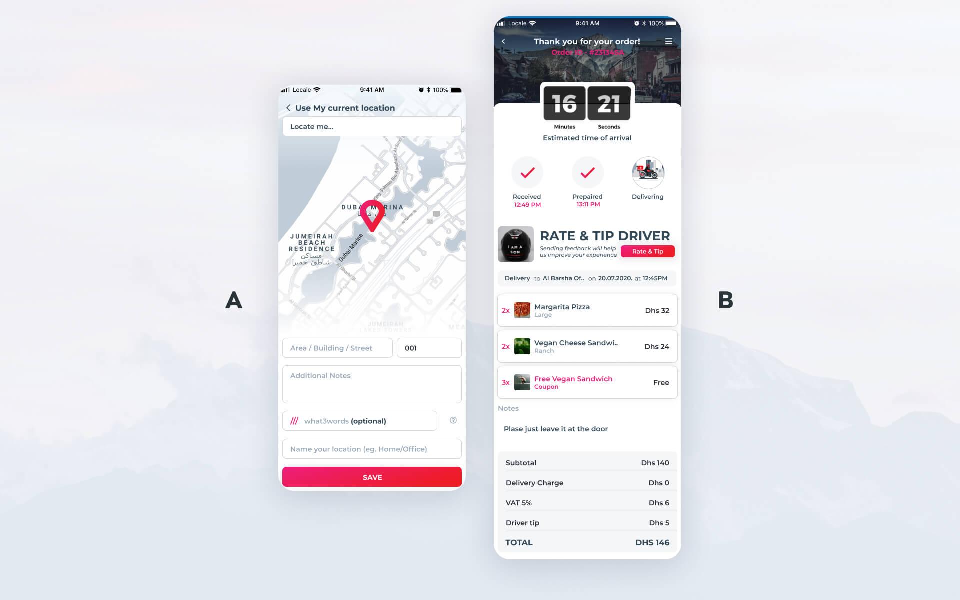
In UI design, this means that you can “trick” the user into remembering what you want them to remember by strategically placing certain items at the beginning or end of your lists. As you can see, this design features the time remaining at the top and the total amount at the bottom-the two things users will be most anxious to see and remember.
7. Zeigarnik Effect/Goal-Gradient Effect
This theory states that people tend to remember incomplete tasks more easily than completed ones.
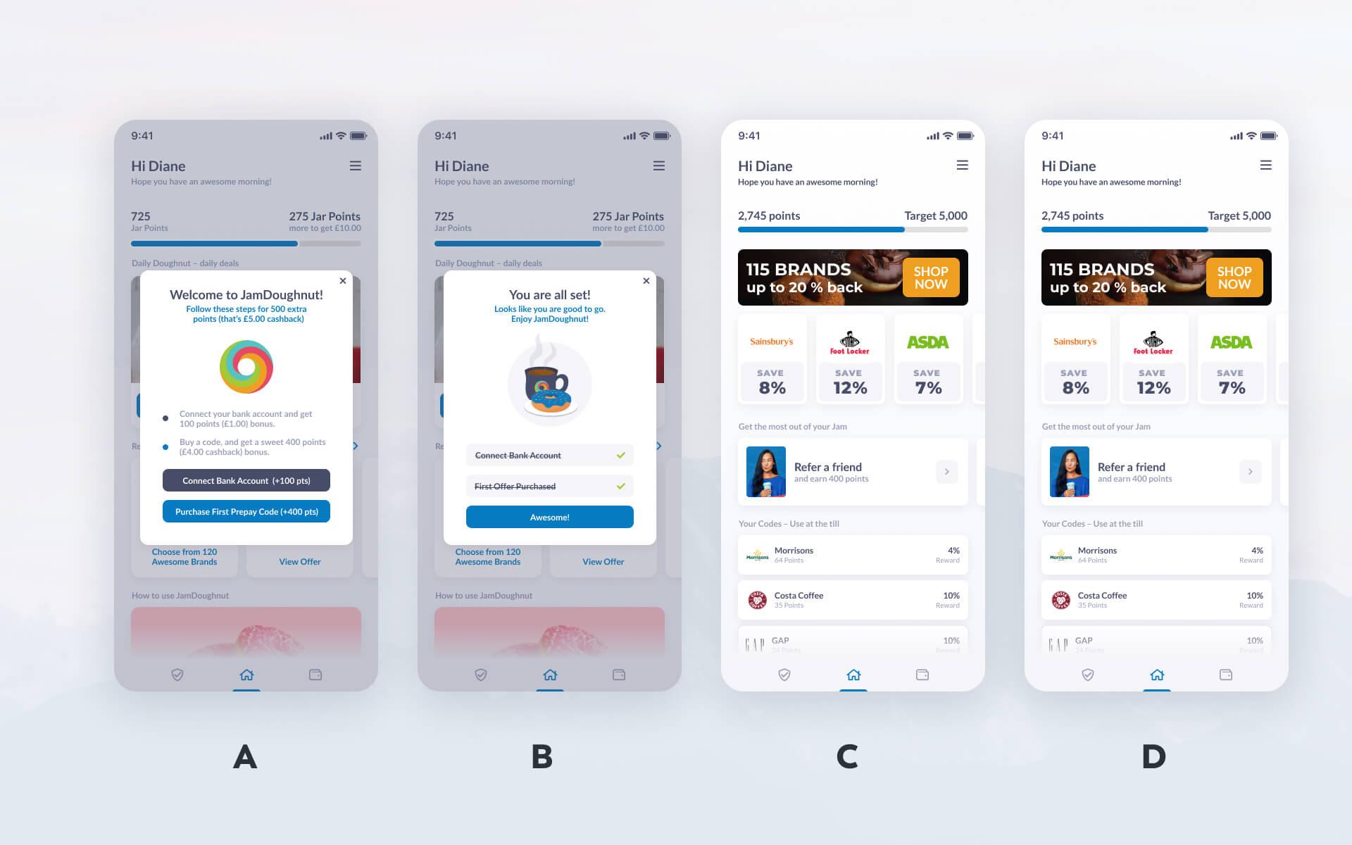
In the example above, you can see how designers have used this concept to keep users engaged. In the first part of the flow, users are provided with a quick to-do list to remind them they are yet to complete their tasks. Completing these earns them points. In the second part, the user is shown a bar indicating her completion, and the points earned, reminding her she is partway toward completing her goal. This solution urges the user to come back for more.
8. Von Restorff Effect
With this effect, in a group of similar objects, the item with a small difference stands out.
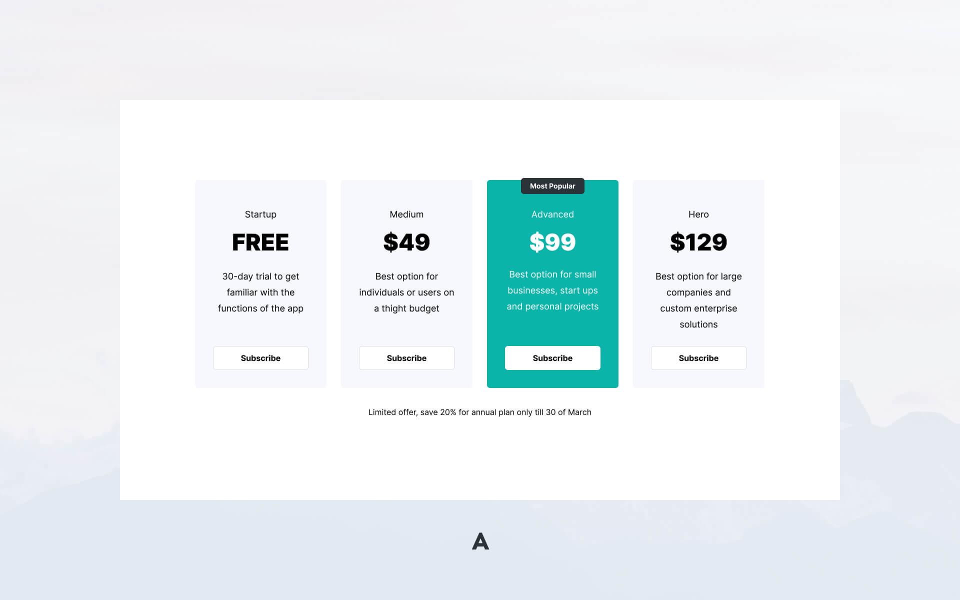
This can be a useful concept to remember if you want to guide the user’s eye to a particular item to help them make the right choice, faster. In this example, the optimal pricing option of $99 is highlighted to encourage the viewer to consider that option first.
VeryCreatives is the Digital Product Agency You’ve Been Looking For
VeryCreatives is a software development company that aims to help young SaaS entrepreneurs create the best possible product. We work with you to deliver the optimal service to your clients, from the first design stages to your first software launch. We will help you understand your market and create a product that fits into that market perfectly.
Curious to find out how we can help you design software that clients can’t help but love to use? Book a call with us today to find out more.