Creating smooth and intuitive user flows can be challenging, even for experienced product owners. Disjointed user journeys not only affect the user’s perception but also impact conversion rates.
No need to worry, though. With a well-thought-out user flow strategy, you can create seamless digital pathways.
This guide simplifies complexities into easy steps, aiding you in solving user flow challenges and designing logical, enjoyable journeys.
What is a user flow?
A user flow depicts the path users take to complete tasks in your app. A good user flow ensures logical and intuitive navigation, presenting information at the right time for effortless task completion.
They help designers and developers understand how users move through a system and identify potential pain points or areas for improvement in the user journey.
Product management teams usually use charts and diagrams to ensure intuitive product design.
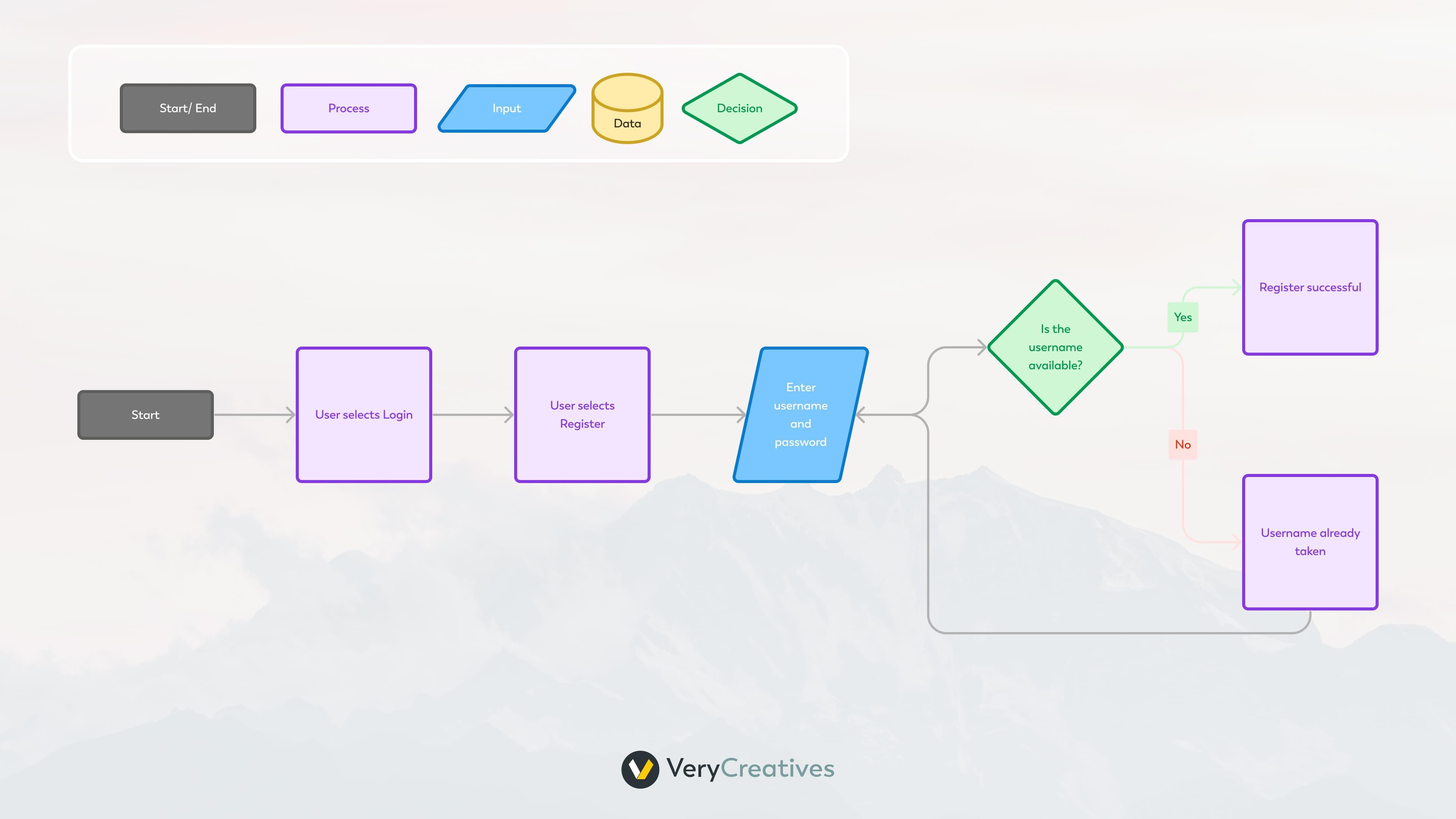
Each node in the flow chart represents a touchpoint on the user’s journey.
For instance, a diamond means the user is making a decision. This is why it’s followed by “Yes” and “No” arrows. A rectangle indicates a task or action that the user needs to take, like “Log in” or “Purchase”.
Why You Should Use User Flows
Now that we know what UX flows are, let’s explore why they are beneficial for the design process. Whether you’re creating a new product or updating an existing one, you can use user flows to:
Identify the happy path
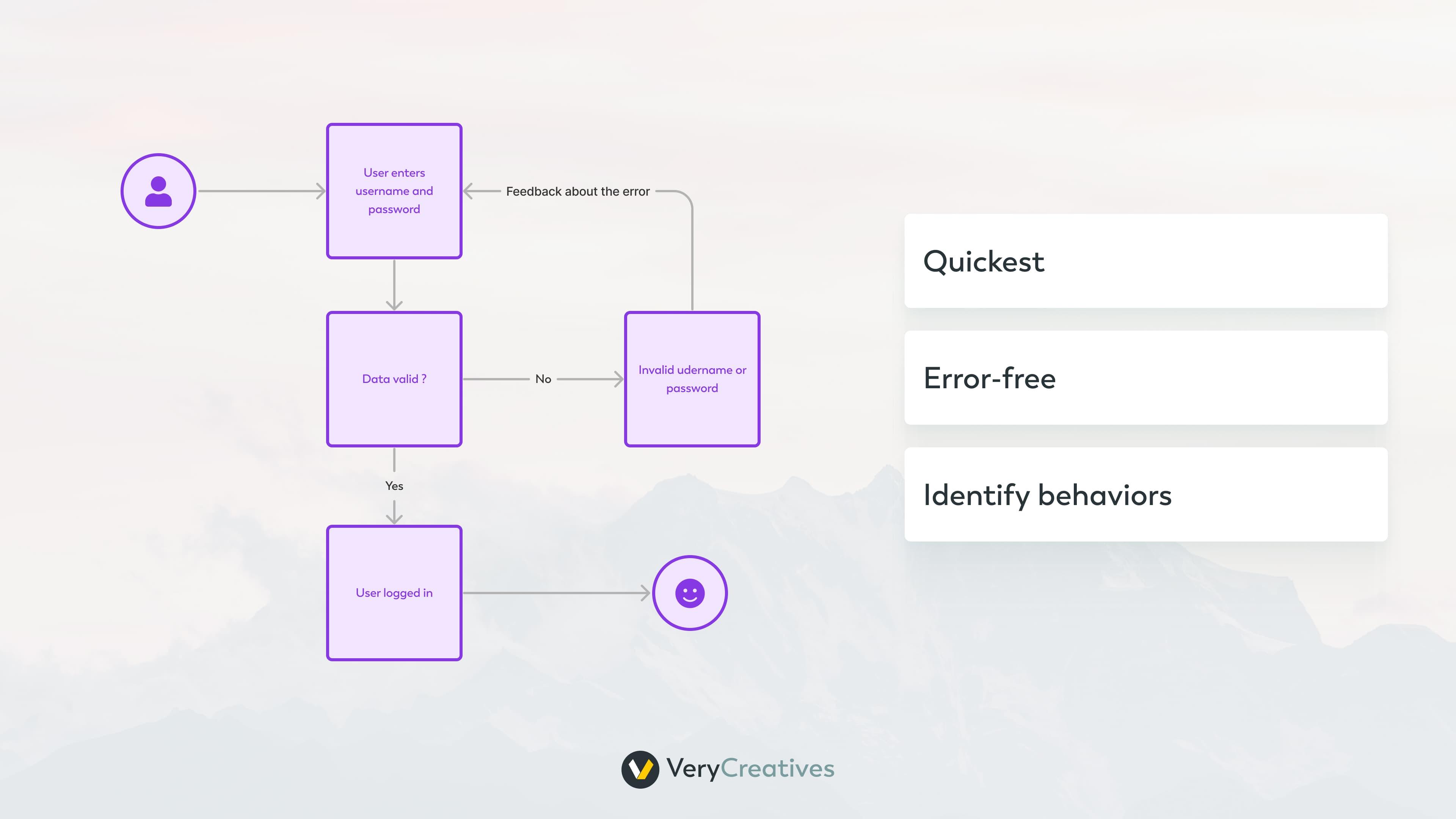
The happy path refers to the fastest, error-free route that users can take to achieve the desired result in your product.
By conducting a user flow analysis, you can identify the ideal journey through your product. Understanding the quickest route to value allows you to identify behaviors that enable more users to reach their goals faster.
This, in turn, helps create engaged and loyal users.
Build an intuitive interface
A well-crafted user flow helps you get user to understand the value behind your product quickly.
It helps them accomplish user goals efficiently, reducing frustration, boosting satisfaction with the product, and increasing their conversion potential.
While building your user flow, look for patterns and routes user can take to complete a certain task. Does every pattern follow a logical structure? Or maybe you see confusing routes a user can take?
For a task management tool, for example, users typically create a new task, assign it to a team member, set a deadline, and mark it as completed. Your user flow should reflect this pattern, ensuring it’s easy for users to follow.
Alternatively, if you see too many steps or clicks needed for a task, try to make the process simpler. This will enhance user experience, save time, and boost efficiency.
User flows help you spot both cases thanks to their simple visual structure.
Optimize Navigation
Understanding the user journey allows designers to create effective navigation paths.
By analyzing user flows, you can identify the most commonly used features or screens and prioritize them in your navigation menus. This will make it easier for users to access the most important and frequently used functions.
User flows also help designers anticipate potential roadblocks or areas where users may get stuck. By identifying these pain points, designers can tweak the flow to ensure a seamless experience for users.
Identify Pain Points
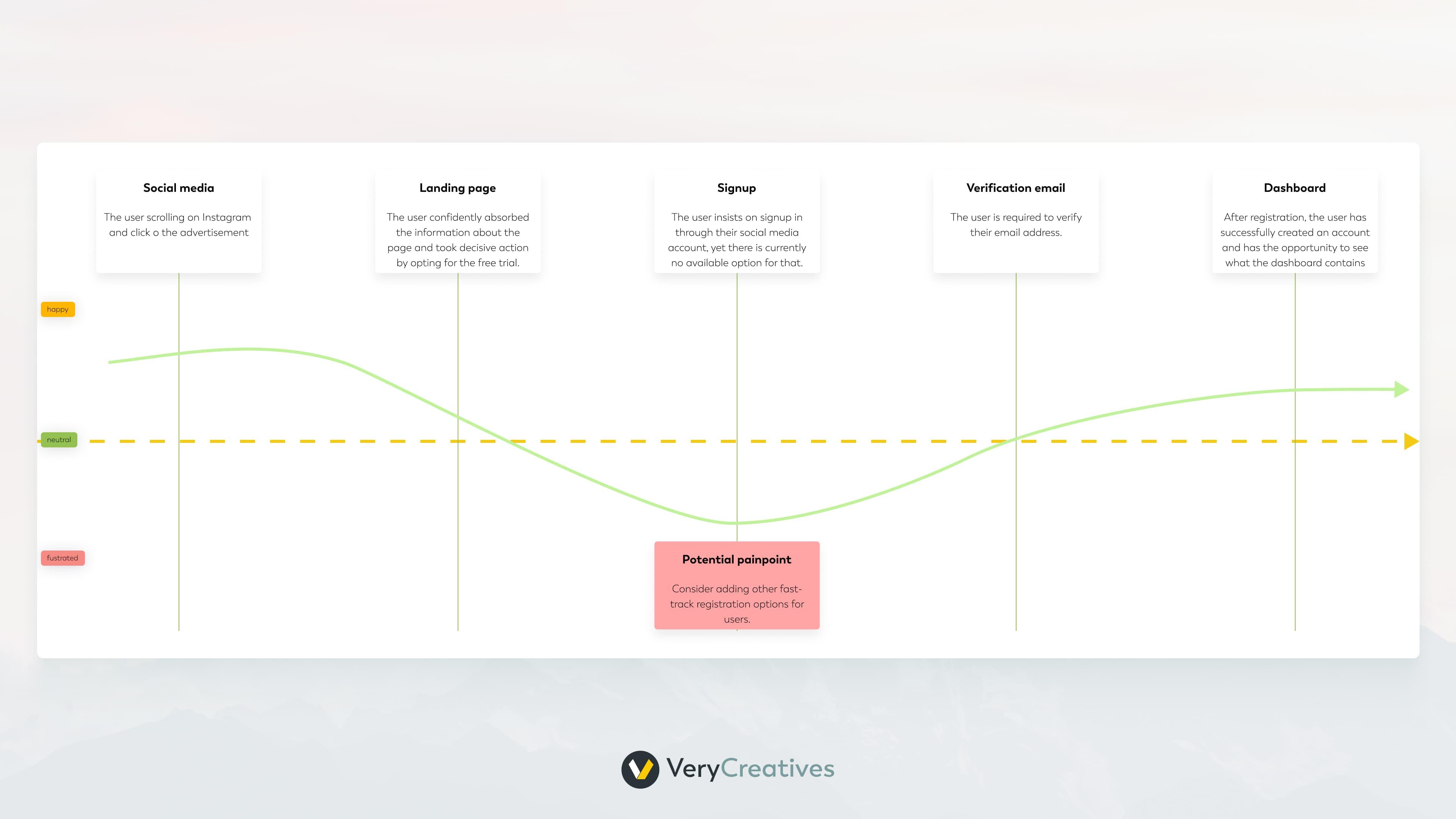
Analyzing user flows helps identify potential bottlenecks or pain points in the interaction process.
This could be anything from a confusing step to a long time between screens. By identifying these issues, designers can make necessary improvements and enhance the user experience.
For example, if users are struggling to locate a specific feature or getting stuck at a certain point in the flow, it is an indication that something needs to be improved.
By addressing these pain points, designers can ensure a smooth and efficient flow for users.
Achieve Business Goals
User flows are designed with specific goals in mind, such as completing a purchase, signing up for a service, or accessing information.
By tracking user flows, designers can analyze how well your app achieves those goals and make adjustments if necessary.
User flows also allow you to spot hindering users from achieving their goals. By addressing these issues, designers can optimize the flow and make it easier for users to accomplish their tasks.
And as Nir Eyal, the author of “Hooked,” mentions:
“Users who continually find value in a product are more likely to tell their friends about it.”
Maintain Consistency Across Devices
User flows help maintain consistency in the user experience across different devices and platforms.
For example, if a user starts a task on their laptop and then switches to their phone, they should be able to easily continue where they left off without any confusion or frustration.
User flows help designers map out these transitions and ensure a smooth experience for the user.
In addition, consistency in design elements such as colors, fonts, and icons helps users quickly recognize your brand and creates a sense of cohesiveness throughout the app.
In fact, color increases brand recognition by up to 80%, so you might put some extra thought into it.
This not only improves usability but also contributes to building a strong brand identity.
Enhance Communication
User flows serve as a visual representation of the intended user journey. They become valuable tools for communication among team members, ensuring that designers, developers, and stakeholders have a shared understanding of the product’s navigation and functionality.
For example, a designer can use a user flow to explain the planned design changes to the development team, ensuring they are on the same page and can accurately implement the desired features.
Make Data-Driven Decisions
Analyzing user flows often involves collecting data on user interactions.
For example, you can track how long it takes for users to complete a specific task or where they tend to drop off in the flow.
Additionally, A/B testing different user flows allows you to compare their effectiveness and make data-driven decisions about which one is more successful in achieving your goals.
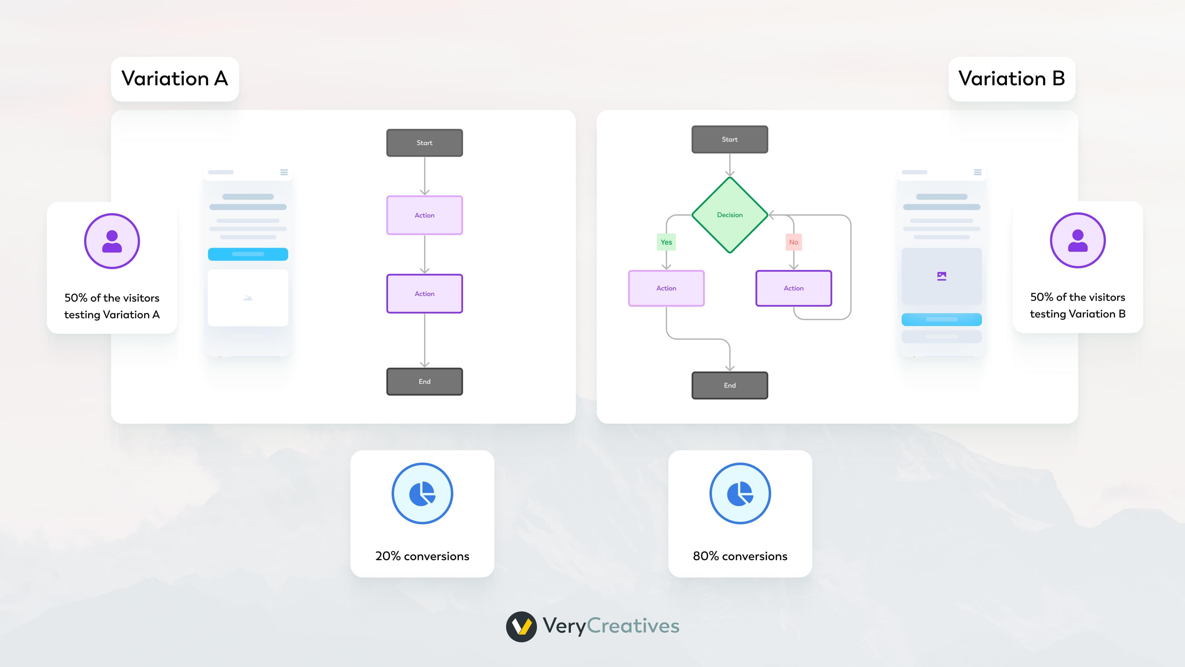
This data can be used to make informed decisions about design improvements, content placement, and feature enhancements based on real user behavior.
How to make User flows as a UI/UX designer?
Creating user journeys requires a systematic approach to understanding and mapping out the steps users take to achieve their goals in a digital product or service. Here’s a simple guide on how to create user flows:
1. Understand the User
Great user flows come from a great understanding of users. Dive deep into your user’s habits, goals, and motivations. This will help you determine how to get user into a seamless, flow-like state when interacting with your product.
A few key questions you should ask when getting to know your user are:
- What does my user need?
- What problems would they like to solve?
- How are they solving it already?
- What features are they actively looking for?
- What do they have to know before they turn into paid users?
- What should they know before their first-time use of the product?
You need this level of understanding to identify key pathways of your user. They are the simplest and most direct but essential to reduce friction in flows like signing up or upgrading to a paid account.
Your favorite question here should be: “Is this feature absolutely, totally, and completely necessary?”
If it’s not – you probably should cut it from the flow. This will make sure the key pathways flow like a breeze.
2. Outline the flow
For each persona and goal, outline the steps users will take to accomplish their objectives, following three main stages:
- Entry point
- Steps to completion
- Final interaction
The entry point is the way users access the product or enter a specific flow.
For example, a popular entry point for a mobile app is through the app store or social media.
The steps to completion are the actions users need to take to achieve their goal, such as filling out a form or making a purchase.
Write each step as a separate node in your flow chart:
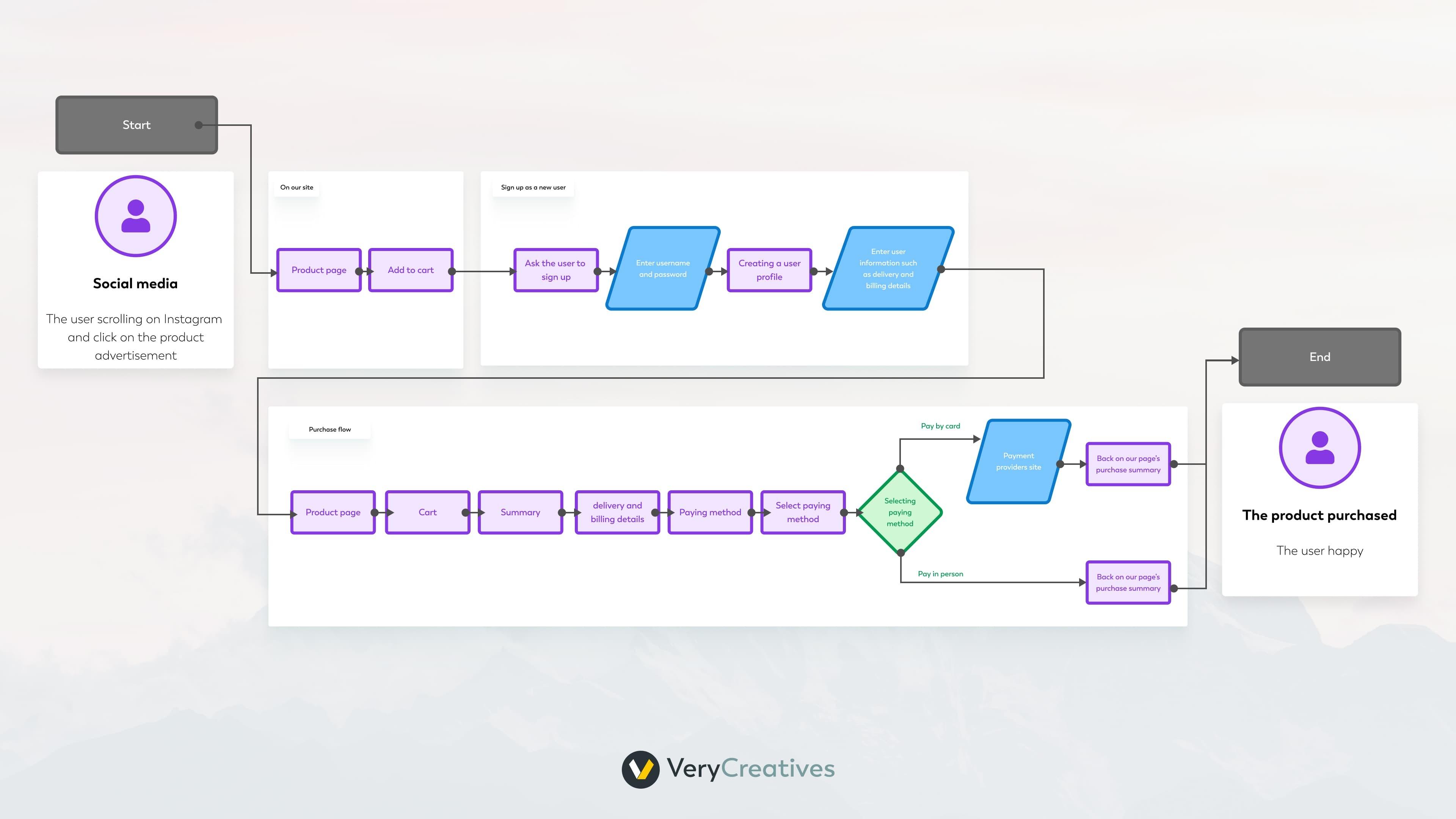
Finally, the final interaction is the point at which users complete their objective and have successfully navigated through the flow.
To immediately distinguish between different parts of your flow, use separate shapes and sizes to represent each set of elements. This will also facilitate other readers understanding of what’s happening in this flow.
Also, sometimes the same shapes can be used to signify multiple categories of actions. For example, our diagram uses triangles to signify entry and exit points for each flow:
To make understanding you flow even easier, you can add a legend to your user flow. This will ensure everyone is on the same page about each diagram:
3. Connect Touchpoints
Connect the touchpoints and steps to create a continuous flow. Understand how users transition from one point to the next.
This helps identify any potential roadblocks or confusion that can be eliminated to create a smoother experience.
Say, you work on a fitness app. The initial flow began with the user logging in and landing on the “My profile” page. The user had to click through the “Recent” tab and find their latest workout plan.
Such flow is unnecessarily complicated and you can simplify it by skipping the “My Profile” tab and redirecting user to their recent workout right after they log in.
Connecting each element of your flow can help you identify inefficiencies like this one. Addressing them will increase user satisfaction and encourage habitual use of your app.
4. Include Decision Points
Highlight decision points where users might have choices or encounter different paths. Consider the possible outcomes of each decision.
For example, in a shopping app, users may have to choose between different payment options. Your flow should account for all possible decisions and their resulting actions.
Decision points can also be used to identify potential opportunities for upselling or cross-selling within the user flow.
Consult those decision points with Marketing or Sales teams to make sure you use their full potential.
5. Validate with User Testing
Test the user journeys with real users to validate the accuracy of your assumptions and identify areas for improvement.
For example, ask users to complete tasks using your user flow and observe any difficulties or points of confusion. Use their feedback to make necessary adjustments and improve the overall user experience.
Gather feedback on pain points, confusion, or any unexpected user behavior. This will inform further iterations of your flows.
6. Document and Share
Document the user journeys in a format that is easily shareable with the project team and stakeholders.
This documentation can serve as a reference throughout the design and development process. Once the app grows, you might forget old mistakes in the flow. Having everything documented will prevent mishaps like that.
How can you help as a client?
As a client, there are several ways you can help in the process of creating user flows as a UI/UX designer:
- Clearly Define Your Objectives: Define the primary objectives, such as making a purchase, signing up for a newsletter, or accessing specific information. Clarifying customer journey maps will help us move faster to refining the flow and optimizing its effectiveness.
- Identify Your Target Audience: Identify demographics, preferences, behaviors, and any other relevant details. The journey should be tailored to address the specific needs you identify during user research.
- Communicate Unique Selling Points (USPs): What sets your app apart from competitors? Understanding the unique value proposition will help designers emphasize these aspects in the user journey.
- Share Brand Guidelines: If you have established brand guidelines (brand colors, typography, tone of voice) make sure to share them with the design team.
- Provide Key User Scenarios: Think of use cases that you anticipate users will encounter. This helps designers understand the diverse paths users might take and ensures that the user journey accommodates different user needs.
- Highlight Pain Points and Prioritize Features: Communicate any pain points or challenges that users currently face with your existing product or in your industry. Prioritize features or improvements that directly address these pain points within the user journey.
- Share Competitor Insights: If applicable, provide insights into what your competitors are doing well and where they may be falling short. Understanding the competitive landscape can inform the design of a user journey that stands out in the market.
- Set Key Performance Indicators (KPIs): Clearly define the key performance indicators that will be used to measure the success of the user journey. This might include conversion rates, engagement metrics, or other relevant KPIs.
- Be Open to Collaboration and Feedback: Foster an open and collaborative relationship with the design team. Provide feedback throughout the design process and be open to iterations and refinements based on user testing and insights.
- Understand the User Journey’s Impact on Conversion: Recognize the direct connection between a well-designed user journey and conversion rates. A seamless and intuitive user experience often leads to higher conversion rates and increased user satisfaction.
Understanding and communicating these aspects as a client will help the design team create a user journey map that aligns with your business objectives, resonates with your target audience, and ultimately contributes to the success of your product or service.
Our way
How are we making and using user flows at VeryCreatives?
Crafting Seamless User Journeys: Our Collaborative Approach
At VeryCreatives, we know that a well-designed user journey is key to a successful digital experience. Our process revolves around collaboration, making sure our clients’ visions align effortlessly with user expectations.
Here’s how we guide our clients through the journey creation process:
1. Scoping Workshop: Listening and Learning
We start each project with a scoping workshop, where we delve into our client’s ideas and plans. Our team actively listens and asks insightful questions to fully grasp the product’s details and the client’s goals.
This helps us identify key decision points and potential opportunities for upselling or cross-selling within the user flow.
2. Ideation and Collaboration: Crafting the Initial Flow
Post-workshop, we distill the insights gathered and translate them into a simple user flow.
This initial flow serves as a starting point for collaboration with our development and UX design teams.
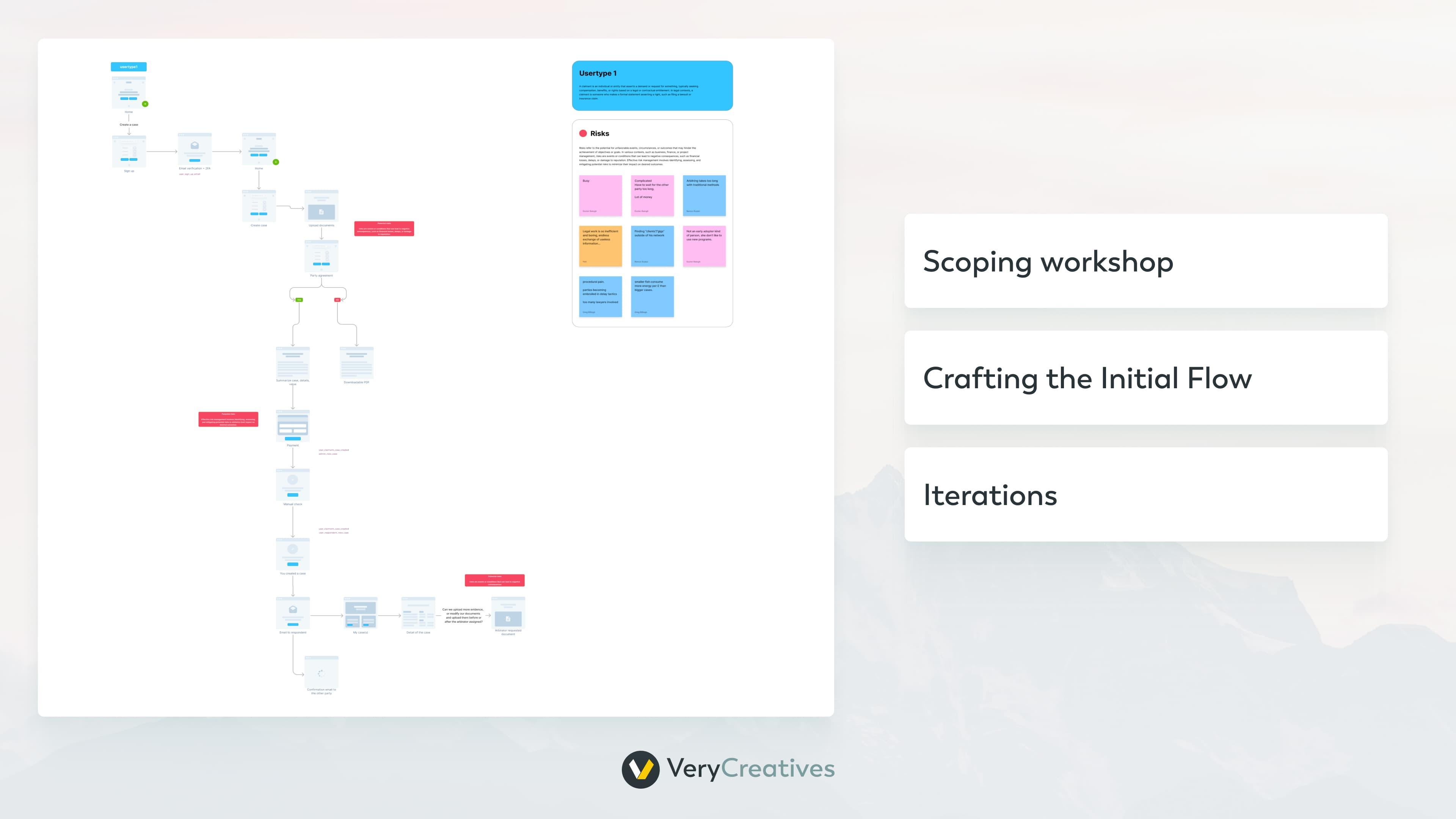
Through brainstorming sessions, we refine the flow, seeking innovative solutions and addressing potential challenges.
3. Client Input: A Crucial Iterative Step
We value our clients’ perspectives and encourage their active participation. After each iteration, we present the evolving user journey for the client’s scrutiny.
Their insights and comments guide the refinement process, ensuring that the user journey aligns precisely with their vision and business goals.
4. Iteration Rounds: Fine-Tuning for Excellence
We believe in the power of iteration.
Following client feedback, our team iterates on the user journey, refining details and incorporating additional ideas. This iterative process continues until we collectively lock in a solution that exceeds expectations.
5. Locked and Loaded: Your Guideline to Success
Once the user journey reaches its final iteration, we lock it in. This visual and informational guideline becomes a powerful tool for our clients, providing a clear roadmap for development and ensuring a cohesive and intuitive user experience.
At VeryCreatives, our commitment is not just to deliver a product but to empower our clients with a user journey that resonates with their audience, achieves business objectives, and sets the stage for digital success.
Book a free call with our expert today and start building flawless user flows.