Since we live in the digital world, icons are all around us. You likely interacted with one or two to get to this blog post. In their basic form, icons are merely small images.
Here are some examples to ruffle your memory: the app icons at the bottom pane of your laptop screen or the same app icons on your phone screen. Similarly, the magnifying glass icon for search and the shopping cart for your Amazon cart are also icons.
Designing these icons takes a lot more than just minimizing large images. You have to consider everything from responsiveness and scalability to user-friendliness and accessibility. In addition, when crafting icons, remember that you can use online tools to resize images, ensuring they maintain clarity and precision across various platforms and devices.
In this icon design guide, we take you through the basics of designing UI icons. You’ll also learn the usage and principles of icon design.
What Is an Icon?
No, we do not mean icons like Elvis Presley or Malcolm X. In UX and UI design, an icon is a small graphical element that represents a concept, object, or action within a user interface.
Think of an icon as your digital language. It’s what you use to communicate with your users without using words.
An icon can be any visual element, including symbols or illustrations. However, the key is that users should easily recognize and understand it. For instance, using a torch as an icon for a built-in phone light makes sense because it’s a universal symbol for light. But you can’t use it for something like email or a phone call.
What is the role of icons in UI/UX design?
Depending on the context, icons can have different purposes in UI/UX design. Here are some of them.
- Navigation: Icons are often used to represent different sections or pages within a website or app. For example, the “home” icon is a common way to navigate back to the main page. Likewise, a web page may have a ”call” icon to get in contact and a “cart” icon to check your shopping cart.
- Visual Hierarchy: Icons can also help with visual hierarchy by drawing the users’ attention to important elements on a page. For instance, using a bright and bold icon for a call-to-action button can help it stand out and encourage users to click.
- Universal Language: Icons don’t have a language. So, they are understood by people speaking all languages. Icons transcend linguistic barriers, catering to audiences from diverse backgrounds. As a result, they make your website more interactive and engaging.
- Aesthetic Considerations: In some instances, icons are used for aesthetic purposes to add personality and character to a website or app. UI/UX designers may use creative icons to give their design a distinct look.
- Usability Enhancement: In UI design, well-designed icons can enhance a product’s usability. These intuitive visual cues make tasks like navigation and interaction easier for users.
7 Principles of Icon Design
No icon design guide could be complete without discussing the main principles of UI icon design. These golden rules will make your icons more iconic. Pun intended.
Clarity of meaning
Let’s take two scenarios. In scenario A, you visit a book blog and see a ‘book’ icon for the list of recommended books. In scenario B, there’s another book blog, but the icon that takes you to the recommended books section is an owl.
Which of the two scenarios communicates its message more clearly?
For most people, the answer would be scenario A. We’re trying to convey that clarity of meaning is an imperative aspect of icon design. Don’t compromise clarity at the expense of uniqueness or over-the-top creativity.
Yes, an owl could represent staying up all night to finish a book, but that’s too obscure. On the other hand, the book icon is instantly recognizable and conveys the message without any confusion. That’s what you need to aim for in icon design.
Similarly, if you look at the Zoom In and Zoom Out icons, you’ll see that the former has a + symbol in the center, while the latter has a - symbol. That makes perfect sense. If these were the opposite, it would confuse the user and hinder usability.
Visual clarity
Besides the clarity of meaning, an icon should also have visual clarity. It should be legible and recognizable at a glance.
When you look at an icon, you shouldn’t have to squint or take a moment to decipher what it represents. Make sure the icon is not blurred or too small. Let there be adequate spacing between the elements so that icons don’t lose their details when scaled down.
Another thing that affects visual clarity is color. The icons should stand out in contrast to the background they are placed on. Avoid using too many colors or shades that blend and make the icon look like a blob.
Familiarity
If an icon is universally familiar, you don’t have to go out of your way to make a unique version of it for your website. Use the one everyone else is using. Your audience will be more likely to recognize it.
For example, the shopping cart icon is used by almost every e-commerce website. If you’re creating an e-commerce site, stick to the cart icon to take customers to their cart. There’s no need to add icons like a basket or a trolley, as customers might be unable to identify them immediately.
Similarly, the magnifying glass is universally known as the search function, and the home is for the home page. The printer is for printing, the envelope for emails, and the phone for calls. You get the point.
Simplicity
Icons are small visuals. There’s not enough space to cram in every detail, so keep them simple. Simplicity brings visual clarity and prevents confusion.
Consistency
Consistency is paramount in UI icon design. You can’t have one icon shaded and blended and the other bright and bold, especially in an interface that will be used frequently.
All icons should have the same visual weight to ensure consistency. It means they should be the same width and height. They should also be the same color if you use a color scheme.
An example of icon consistency is MS Word, which you’ve used since school. All icons you see in the toolbar have the same visual weight. You should also strive for something similar in your icon design.
Branding
Just because there are rules doesn’t mean icons should be devoid of personality. You can still add a personal touch to your icons as long as you don’t stray from the rules.
For example, the icons can be your brand’s colors. Or they may use a font that is consistent with your brand’s typography. The scope for creativity is limited, but it’s there.
Brands in the hospitality industry, such as hotels, restaurants, and travel agencies, can also incorporate icons related to their specific services or products. For instance, a restaurant may use a table icon to indicate its dine-in options, a bike icon for delivery orders, or a chef’s hat for its menu section. Similarly, a hotel may use icons for different room types, amenities, and services offered.
Other industries do this, too. For example, if you open the navigation pane on Target’s website, you see icons for pickup, delivery, weekly ads, top deals, Target circle offers, and clearance. All these are red in color to signify Target’s branding. Since these offers are unique to Target, the icons, although not universally recognizable, serve their purpose as brand identifiers due to their clarity of meaning.
Balance and alignment
We kept this one for last because it deals with the details. Ideally, the icon should look well-balanced and aligned to the users.
Take the example of the Download for Offline icon in Google’s icon library. It has a circle with an arrow pointing downward to indicate you’re “down” loading. Now, what if this arrow was pointed to the right? That would be irksome, to say the least.
Another example is the Upload icon. The arrow here points upward. It would make no sense if it pointed to the left or - even worse - downward.
Things to Keep in Mind As a UI/UX Designer When Designing Icons
Besides the seven principles we discussed so far, there are two other things you should keep in mind when designing icons.
Scalability
Create the icons in high resolution to ensure they maintain their quality at any size. Remember, your app or website may be accessed on various devices, from smartphones to large desktop screens. All users should be able to see the icons clearly.
You can also keep icons vector-based, as they can be scaled to any size without losing their quality.
Adaptation
Remember how we talked about Google’s icon library above? Google has different icon versions for the web, iOS, and Android. You should, too.
Your icons must adhere to platform-specific guidelines and user expectations. Therefore, don’t just copy the same icon for all platforms. Instead, adapt it to fit each platform’s visual language and design guidelines.
How to Design Icons: A Step-by-Step Guide
Now, on to the practical part. Here’s a step-by-step icon design guide you can follow.
Step 1: Define the purpose

At VeryCreatives, this is how we start the process. We brainstormed the idea with our team. Everyone sits together to answer the following questions:
- What is the purpose of the icon?
- In which context is the icon used?
- What action is the icon going to represent?
- If it represents a concept, how can we translate it into an icon?
The insights we derive from this session help us with the ”clarity of meaning” principle of UI icon design.
Step 2: Research and ideate
In the second step, we start sketching and experimenting based on the insights we got in step 1. Our goal is to come up with at least three different solutions for each icon.
For more complex icons, this step might involve more in-depth research into the target audience and their visual language preferences. The key here is to visualize the form and style of the icon.
Step 3: Choose a style
Since we now have a few options, we can decide on a style for our icon. Some common styles are minimalist, flat, skeuomorphic, dimensional, glyph, and material design.
Don’t select a style on a whim. Instead, see if it aligns with the overall design of your project.
Step 4: Set a grid

The “grid” will be the skeleton of your icon. The aim is to achieve consistency in the size and proportions of your icon.
For example, if you go for the flat design style, the grid will have simple geometric shapes like squares and circles. Simply put, a grid helps refine the icon’s look and feel.
Look at PhosphorIcons as an example. Although it’s a huge icon library, every single one of them has the same visual weight. You don’t even have to measure them. A glance can tell you they were made on a grid and have the same line thickness and height.
Step 5: Balance the proportions

Remember how we talked about balance and alignment earlier? That’s what you’ll do here.
There should be proper spacing within the icon and between the icon and the text surrounding it. If there’s not enough space, the icon may form a mush with the text, making it hard to understand. Similarly, too much space will make the icon look disconnected from the text.
If the icon has multiple elements, make sure their proportions are balanced, too. The icon shouldn’t seem as if it’s “tilted” or “leaning” to one side.
Step 6: Make color choices
When it comes to design-driven development, you sometimes have to compromise on creativity and lean more towards functionality. Color is one of those domains.
If you’re not sure about the color palette, pick one color and stick to that. Add more shades of the same hue if you need to develop an icon family. Remember, your icon should look good in both light and dark modes. Always test it in both modes before finalizing your color choices.
Adding shadows or gradients to the icon can add depth and make it pop. However, be careful to do it sparingly, as it can make the icon look too busy or distracting.
Step 7: Ensure alignment with the brand
Since we work with a wide range of brands, we must ensure the final product fits the rest of the branding. We incorporate the brand’s typography and color palette into the icons for that.
Even when designing icons for just your website, you must ensure visual consistency. The icons shouldn’t look like an oversight. Users will quickly pick up on this and perceive your brand as unprofessional or unorganized.
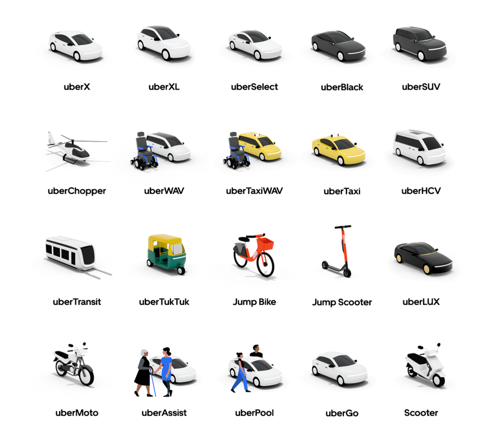
Uber’s example is our favorite in this regard. The ride-hailing app could have used the same car icon for every type of ride. However, they went the extra mile by designing unique icons for ride classes, like UberX, UberBlack, UberTaxi, UberSelect, etc.
Uber also offers other modes of transport, such as TukTuks and jump bikes, depending on the geographical location. Instead of using a generic mode of transportation icon, they have unique icons for each mode. You can see the whole fleet here for a visual delight.
It’s just the perfect example of how you can make icon design less ”boring” and more on-brand.
Step 8: Test for clarity at different sizes and on different backgrounds
Before you give the okay to your icon, test it at different sizes. After all, the icon will also appear in buttons and navigation bars. Now, imagine the same navigation bar on a phone screen. That’s even smaller.
Your icon shouldn’t be microscopic for a mobile phone user. So, test it out on different screen sizes.
Do the same with backgrounds, too. If your icon blends into the background, it can become invisible. You don’t want to use an icon no one can see or understand.
Ace Your Icon Design With Stellar Product Design
Now that the icon design guide has ended, we hope you can understand the importance of icons and how they can make or break the user experience. However, icons aren’t the only component that brings your designs to life.
A lot else goes into product design, too. At VeryCreatives, we tackle all these aspects, bringing your vision to reality in the form of a market-leading SaaS product that doesn’t only connect with your audience but also captivates and inspires.
Our process revolves around making product design user-centric, so you can rest easy knowing the end product will be nothing short of excellence. Book a free assessment call to kick off your next project today.
%20-%20http://www.bohemiancoding.com/sketch%20--%3e%3ctitle%3eLogo%3c/title%3e%3cdesc%3eCreated%20with%20Sketch.%3c/desc%3e%3cg%20id='Page-1'%20stroke='none'%20stroke-width='1'%20fill='none'%20fill-rule='evenodd'%3e%3cg%20id='logo-gap'%20transform='translate(-21.000000,%20-21.000000)'%3e%3cg%20id='Verysite_2018_Logo_gap'%3e%3cg%20id='Logo'%20transform='translate(20.895000,%2021.072000)'%3e%3cpath%20d='M59.178,0.456%20C91.6442925,0.457642562%20117.970749,26.7617206%20118,59.228%20C118,91.7142174%2091.6647174,118.0495%2059.1785,118.0495%20C26.6922826,118.0495%200.357,91.7142174%200.357,59.228%20C0.386250972,26.762111%2026.7120979,0.458194449%2059.178,0.456%20Z'%20id='Path_1430'%20fill='%23293338'%3e%3c/path%3e%3cpolygon%20id='Path_11112'%20stroke='%23293338'%20stroke-width='3'%20fill='%23F4FAFF'%20stroke-linecap='round'%20stroke-linejoin='round'%20points='71.085%2089.532%2046.159%2089.532%2019.526%2045.005%2034.226%2027.942'%3e%3c/polygon%3e%3cpolygon%20id='Path_11113'%20stroke='%23293338'%20stroke-width='3'%20fill='%23FDCB00'%20stroke-linecap='round'%20stroke-linejoin='round'%20points='46.176%2089.532%2071.096%2089.532%2097.743%2045.005%2083.031%2027.941'%3e%3c/polygon%3e%3c/g%3e%3c/g%3e%3c/g%3e%3c/g%3e%3c/svg%3e)
